Apologies for the crazy length of time since the last blog but been away a lot organising various projects for 2015. More on that later …
Kept in touch via the inescapable Twitter @andieairfix
with #MoodOfTheDay and #AirfixArchives. Twitter feed and follow …
First … The Holidays. I hope you all had a wonderful time …
Secondly … I’d like to thank everyone who had The Inclination and The Taste to buy Airfix Editions over the holiday period.
Thank You all.
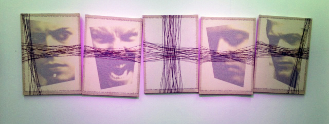
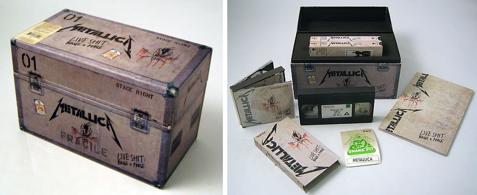
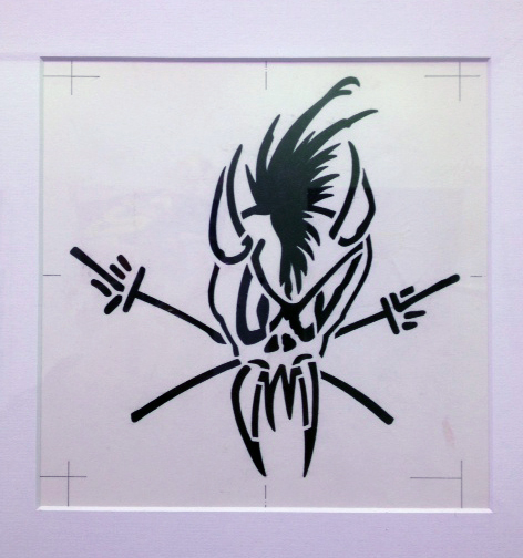
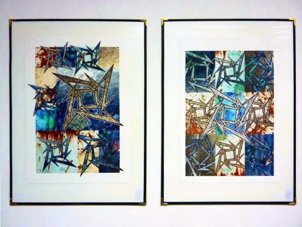
Some Prints and Editions are still available of course … METALLICA, BOWIE, MADONNA, ROLLING STONES, DEF LEPPARD, LED ZEPPELIN, JIMI HENDRIX and more. Go on … you know you want to … andieairfix.com
To welcome you into 2015, I’d like to take the opportunity to thank my followers on Twitter and those loyal to my blog with a quote I love from the wonderfully anarchic and irreverent world of one of America’s greatest novelists and comic writers.
“HELLO BABIES. WELCOME TO THE EARTH.
IT’S HOT IN THE SUMMER
AND COLD IN THE WINTER.
IT’S ROUND AND WET AND CROWDED …
AT THE OUTSIDE, BABIES, YOU’VE GOT
ABOUT A HUNDRED YEARS HERE.
THERE’S ONLY ONE RULE
THAT I KNOW OF, BABIES
– GOD DAMN IT,
YOU’VE GOT TO BE KIND.”
A Happy, Healthy, Prosperous and Peaceful New Year to You from Andie Airfix at
I will leave you with an image commenting on the tragedy in Paris yesterday. It is poignant, wonderfully direct and implies hope and defiance in equal measure. Brilliant.
More very soon on Plans for 2015 … including taking a one-man show to Japan (and maybe more places!)
Finally on the road to publishing a novel ‘ I N V A G E N T S ‘
and a design book entitled – yes you guessed it ‘B*B G#LD*F STOLE MY SUNGLASSES’
Thank you – all who were involved with my ‘gig’ at the ‘Moulin Rouge’ Spiegeltent as part of the Brighton Fringe – particularly Richard, Jo, Mandy and the guest keyboard player, Richard Clark-Monks. A very special thanks to Adrian and all those at the Tent who made the performance happen and run so smoothly.
Early on in my chat I was talking about Holly Woodlawn – the Warhol Superstar …
… and major player as part of the Warhol Factory in New York. Lou Reed immortalised Holly …
“Holly came from Miami, F.L.A. Hitch-hiked her way across the U.S.A. Plucked her eyebrows on the way Shaved her legs and then he was a she She says, “Hey babe, take a walk on the wild side” He said, “Hey honey, take a walk on the wild side“
Halfway through my stories of spending 3 weeks with Holly in London,
(see Blog ’50: LOU REED – ‘Life-Changer’ for details!)
someone unexpectedly walked towards the stage. I did a real double-take. It was the legend HERBIE FLOWERS. Herbie Flowers was a founding member of the group BLUE MINK, featured in a mid-1970s line-up of T-REX and later played bass with many superstars including David Bowie and Paul McCartney. I had NO idea he would be appearing and I sat down on the stage and listened to his wonderful story about how the classic bass line was created in the studio with LOU REED. Watching him play his bass to explain how the riff developed was one of those moments of history for me
Thank You Herbie Flowers – you made my day/week/year …
The talks ‘Graphic Design as an Extreme Sport‘ will continue and who will show up next time I wonder?
Who knows? – not me – not yet.
Make sure you check out the rest of the blog for stories of working with ‘Megastars’!
Preparations are now well under way for fun, drinking and debauchery at the ….
On Friday 16th May 2014 from 6-7 pm …
… I’m very excited and honoured to be asked to talk at the famous ‘Moulin Rouge’ Spiegeltent as part of Brighton Fringe. After the country’s largest music festival ‘The Great Escape‘, I shall be chatting about how iconic designs are created for legendary music stars in the utterly insane world of Pop Music and Rock’n’Roll, and telling stories of what it’s like to work with music’s unpredictable ‘megastars’ …
Starting Out • ‘PYROMANIA‘ and 9/11 • Dealing with ‘difficult’ clients • Creating ‘HYSTERIA‘ • PETE BURNS tells a few home truths to Sony • Pre-computer Techniques • “You’ll never work in the music industry again” • Finding allies in business • With METALLICA honesty always wins • Buttock-clenching embarrassment at opening night of ROLLING STONES tour • Joys of Typography • Working at Clarence House • Get out and about • Designers ultimate nightmare • The pressures working on LIVE AID and LIVE 8 • Axl Rose flips out • Fans and Parties • Lessons from PAUL McCARTNEY • The wonderful Victor • Challenges from LED ZEPPELIN and much more.
The venue is hardly your average tent …
… but this extravagant and colourful venue was erected in less than 5 hours !!! The original Spiegeltents were the ‘domain of night-owls, heartbreakers and dream-chasers’. They were legendary and still are.
Don’t miss out.
Book your tickets now at brighton fringe website
or Box Office on 01273 917272
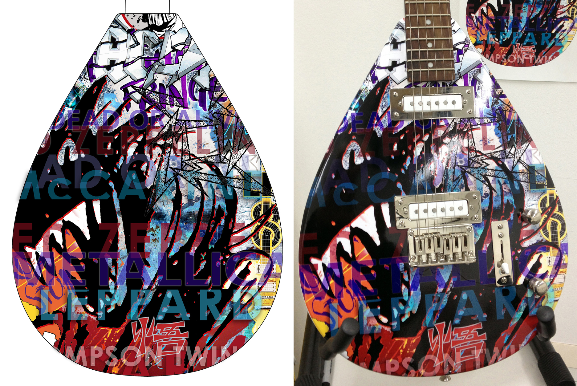
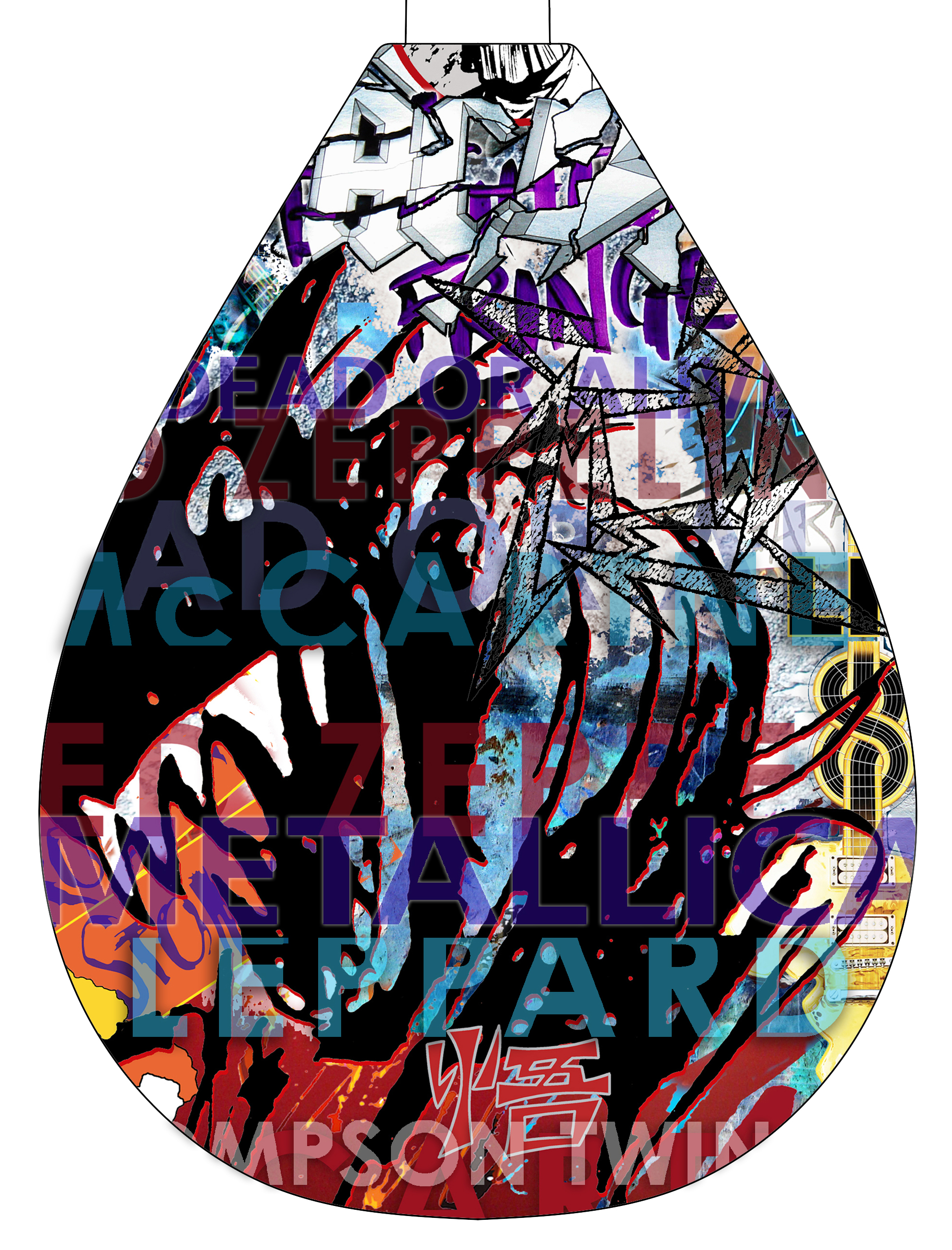
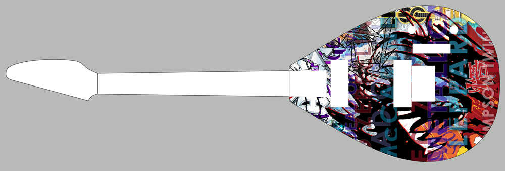
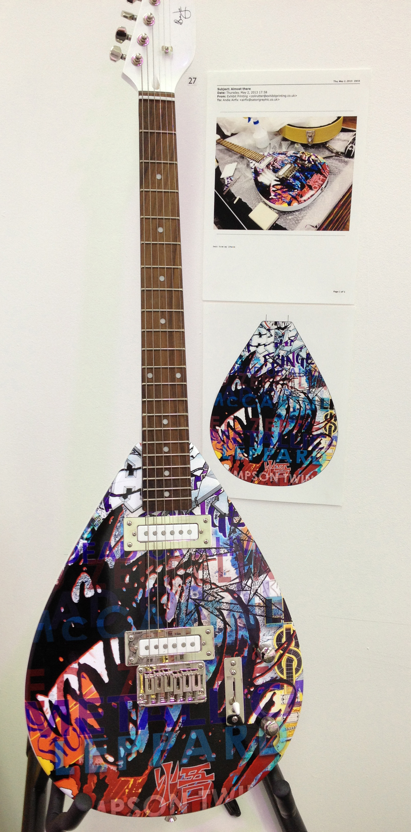
Is it a Bird? Is it a Guitar? Is it Art? Does it Play?
Well – three of those certainly. (I don’t think it flies – yet.) Depends who buys it. I could think of a few people who could help it on its way.
I created this guitar (with more than a little technical help from Zoli) as part of the AIRFIX LOUNGE exhibition at the Brighton Fringe this year. It celebrates many of the artists I have worked with over the years including METALLICA, LED ZEPPELIN, DEF LEPPARD, AC/DC, THOMPSON TWINS, DEAD OR ALIVE & PAUL McCARTNEY.
The Hutchins limited edition (of 250) guitar is a replica of the famous ‘teardrop’ guitar played by Brian Jones of The Rolling Stones. The edition was a sell-out apart from a few retained by Hutchins Guitars. This is one of them – edition number o99. It was kindly donatedby Gary Hutchins – to help support and promote the launch of the ambitious AIRFIX LOUNGE project.
The guitar has escaped to EBAY to help further the expansion of the AIRFIX LOUNGE
The LOUNGE was a huge success (much more on that in another blog soon) and there were so many comments received from the US, via various social media, asking if the exhibition and talks would transfer to America.
In answer to those exhuberantly supportive fans – I’m happy to announce that talks ARE in progress right now to take the AIRFIX LOUNGE to a major US city. Stay tuned.
Here’s the Beast in more detail – the design perfectly replicated on the body of the guitar
So … hang it on your wall,
play it,
fly it,
love it
and also help us get the show further down the road as the AIRFIX LOUNGE expands and begins to tour – bringing a great rock-art show to those fans who have been so positive about the project so far.
I have to start with a ‘comment’ I noticed on one of the DOA videos in the last blog … ‘such people who balance between being woman and men caused interest to observe them…’ – says it all really. I spent time this week looking through my studio DOA archives and was astonished how much stuff there was. I found drawers full of original artwork for various DOA logos and hand-created type, artboards with overlay printer instructions (this is pre-computer still) for tour prgrammes, sleeves and posters. I also found sketches and ideas which were never used. Two things occurred to me rummaging through my drawers (so to speak) – firstly that there will have to be more of Dead or Alive at a later date and secondly that you may be intereseted in some great designs ‘that got away’ – either because they were never used or if they were, the albums were not commecially successful.
I came across a band a few years ago and fell in love with their music. I offered to design an album for them. They had no money but sometimes you have to follow your heart. I still listen to their wonderful music whenever I need cheering up or when I need reminding there is still amazing talent out there. Unfortunately, through circumstances and incompetant promotion, the album disappered without trace. I still rate it as one of my favourite albums and most successful designs.
After I created the logo for the brilliantly-named ‘GEEZERS OF NAZARETH’, I printed it out, screwed it up into a ball and kept it in my back pocket for over a week. There is no way a computer programme could create the authentic texture of the final logo …
Anyway, I digress. I went to see Pete one day and Lynne warned me Pete was recovering from an operation on his nose (the fourth I think he said) He was on good form and we quickly made decisions on the artwork. It was difficult not to react to the bandages, his swollen face and the two black eyes the operation had inflicted on him. I asked him why he did it and his answer was both enlightening and disturbing. ‘I’m addicted to the fear,’ he said, ‘Each time I do it I’m absolutely terrified it could all go wrong. On one level it’s about image but on another level it’s about overcoming the fear so I experience the unbelievable high when its over and everythings ok.’
Eventually it did all go wrong. One of the most honest interviews I’ve seen Pete do was on the ‘Richard and Judy’ show. As I’ve said before Pete is totally honest in any situation, and morning television was no exception. They asked the questions and he answered them. Simple. His clarity talking about surgery, Big Brother and relationships is so open and candid – it’s almost shocking. Watch the two-part interview and see for yourselves …
Success fuelled Pete’s anarchic delight in creating an even more outrageous image. The photographs for the ‘Nude’ album were extraordinary and the design for the sleeve needed to be pretty full on …
I love this sleeve. We spent a day photographing a sea of roses, carefully selecting colours to tie in with Pete’s image. After combining the two images we decided the typography style should be as far removed from the image as possible – hence the blackmail/punk style lettering on a harsh black background. The combination of such disparate elements shouldn’t work but maybe that’s why it does – sometimes the most unlikely combinations succeed because of their audacity.
In the studio while I was working on the sleeve I had a dozen photos from the album photo-session pinned on the wall – large 20 x 16 colour prints. A courier who often delivered stuff to me walked through the door and his jaw hit the carpet when he saw them. ‘PHWOAR!’ he said, ‘I wouldn’t mind a bit of that. She’s fuckin’ beautiful mate. Who is it?’ ‘Pete Burns,’ I said heavily emphasising the ‘Pete’. He didn’t know where to put himself. With one foot already out of the studio and the other still firmly in his mouth, his face so red I thought he was going to explode, he fixed his gaze on the floor and squeaked, ‘Sign here please.’ He fled down the corridor and raced down the outside fire escape as if Beelzebub was in hot pursuit. I never saw him again. Pete would have loved it.
The last video is one of my favourite songs by Dead Or Alive. It’s that voice again. Also it’s a wonderful collage of photos from different periods of Pete’s career.
Reluctantly we now move on from Pete and DOA (but there WILL be more later). Next week we move to the opposite end of the music spectrum and go back a couple of years. I was invited by the legendary Peter Mensch to come up with ideas for the DEF LEPPARD ‘Pyromania’ album.
There were so many reasons why I adored Pete Burns. Like Grace Jones and Alannah his ‘difficult’ reputation preceded him. (You may by now have spotted a recurring client theme but believe me – there are those who really ARE difficult as we’ll discover.) Pete genuinely baffled people. His striking, androgynous public and private image seemed at first to contradict the person you met in real life. I was immediately struck by how beautiful he was. His skin was flawless, his make-up stunning and his clothes (admittedly extreme) were fabulous. What freaked people out was that everything except his appearance was unquestionably masculine – he was tall, muscular, not at all camp and he spoke with a deep strong voice in a broad Liverpool accent. What upset people even more than the apparent contradictions was Pete’s incisive and breathtaking honesty in any situation. Once I got to grips with that and he recognised I wasn’t phased by him – our relationship was refreshingly simple and direct. He was also fantastic company – knowledgeable and hilariously entertaining.
Pete and I had spent considerable time working on the ‘Youthquake’ album sleeve (the album with the ‘You Spin Me Round’ track) – and we were really pleased with the final design. However, when I took it to Epic/Sony to show them – they had a ‘major problem’ with it. I met up with Pete to share the record company grievances and he immediately called a meeting with executives of Epic and the MD of Sony. We went to Soho Square and Pete barely disguised his anger as marketing ‘experts’ outlined their ‘concerns’.
Pete was always totally in control of his image and my job was to produce graphics which complemented whatever it was at the time. Designing sleeves for him always began with an image he’d chosen – of him obviously! Sometimes it was playful, sometimes deliberately shocking and always sexy in all manner of different ways. The photo for ‘Youthquake’ was harder to define. It was taken by the comparatively unknown Mario Testino. (Pete was always at the heart of a talented and edgy creative London scene and many unknown photographers whose talents he recognised and used became famous.) The ‘Youthquake’ photograph was dark, richly textured and Pete’s pose was unconventional to say the least. The picture had an unnerving sense of menace about it. That wasn’t the record company problem though.
I had decided typography for the sleeve should be simple and classical – nothing fussy or too clever which detracted from the power of the image. Although we both agreed it was the right approach, I couldn’t get it to work well enough for a resounding ‘Yes, that’s it!’ from either of us. I wiped the slate clean and started again (‘no matter how hard you hit it etc …). My solution, which produced the resounding ‘YES!’ for us both was Sony’s ‘major problem’. The title of the album was four times bigger than the name of the band and in their infinite wisdom the record company thought the record-buyers would think ‘Youthquake’ was the name of the band (yes – I know!).
We both listened to uninspired ‘alternative solutions’ and – clearly fearful of Pete’s reactions – marketing constantly referred to their ‘respect for their artist’s views’. I knew Pete’s restrained silence was working up to a devastating negation of their ill-judged attempts to change his mind. He stood up when they’d finished, took the mock-up sleeve from the table and held it up in front of him. He turned slowly showing the sleeve to everyone in the room. Each word he spoke – in that deep voice, resonating with the authority of a Liverpool bruiser – was delivered like a bullet to the head.
‘This,’ he said, pointing at the sleeve, ‘is an album cover.’ He paused. ‘An album cover – NOT a FUCKING cure for cancer! This is what I want. Deal with it.’
Genius. With that perspective what could anyone say? Exactly. Nothing. We left. Job done. Another great Pete encounter after a short design interlude …
DESIGN OBSERVATION 3 – TYPOGRAPHY.
I love it. The 26 symbols which create our basic alphabet have (for obvious reasons) completely different shapes. Some, graphically and visually, fit together well and others don’t. This is a fundamental design consideration when creating large type headings or, in the case of YOUTHQUAKE’ – a single word title. A computer program produces the same space between each letter and often letter-spacing needs adjusting. Examples will make this clear …
On the top line (computer spacing) some spaces between letters obviously need adjustment. The ‘A’ and the ‘V’ of ‘AVID’ is probably the best example. Once this concept is understood it’s easy to see where other adjustments need to be made. There is no hard and fast rule to correct spacing – only an intuitive ‘eye’ will confirm what looks right. A total of three space adjustments were made on the second line and two in the word ‘YOUTHQUAKE’ on the fourth.
At the time of ‘Youthquake’ designers used typesetters and Letraset (rub-down individual letters) to create type on artwork. With Letraset this meant physically placing each letter on the artwork. The eye intuitively adjusted spacing between letters as they were laid down and, although it took time, it was no bad thing. These days too little consideration is given to adjusting type which is computer generated. It’s detail I know but if a piece of work is worth doing, it’s important to bring to it a whole range of skills to do it properly.
(I have a great story later involving Lars Ulrich from Metallica about typography. He had an eye for it which was verging on obsession.)
I can’t remember exactly when it was (things were pretty crazy on many levels at the time) but I went for a meeting with Pete at his home in Notting Hill. The three people living in the house were Pete, his fabulous wife Lynne and Steve Coy from the band. Whenever I visited the house I always looked forward to it. I was always made welcome, engaged in intelligent conversation, had many laughs and we usually reached agreement on artwork eventually.
There was something different this time. The large front room was littered with several lightboxes, piles of photographic contact sheets and hundreds of transparencies and 8×10 colour and black and white prints which covered every surface in the room. It was chaotic to put it mildly, Pete was more hyper-active than usual, less focussed which was unusual, somewhat self-conscious (!) and constantly diving in and out of the room. I asked him if everything was ok. He stopped, sat on the sofa and said, ‘I have to stop taking Prozac. It’s turning me into a monster – more self-obsessed than I usually am.’
Pete suffered and endured severe depression. I had never heard of Prozac before then but Pete had discovered the ‘new wonder drug’ to treat his illness. I don’t know what dosage he’d been taking or over what period ( I hadn’t seen him for a couple of months) but knowing him – probably more than he should have. What I was seeing, he said, were the chaotic effects of the drug.
‘I was nearly arrested last night’, he said. ‘I went to a party wearing something impractical’ (it was an outrageous trouser-suit I learnt later!) ‘and a pair of six-inch stilettos. On the way back to the car I decided the shortest way to get there was OVER cars not round them. God knows how many I damaged but I got stuck when the stilettos punctured the top of a soft-top Mercedes.’ (Hopefully not Christopher Hunter’s!)
Picturing Pete, his wild hair blowing in the wind, wearing a silver chain-mail, bell-bottomed trouser suit (oh yes!) attached to a sports car and calling for help in the middle of the night is an image that will stay with me for ever. However hilarious it seems on the surface it was the catalyst which made him realise something was horribly wrong. ‘You know what I did last week? I insisted my clothes designer move into our spare room – so when I woke up at four in the morning with some crazy idea for clothes, I could wake him up to start work immediately. Crazy – fucking crazy. The Prozac HAS to stop!’
Such encounters endeared me to Pete’s honest complexity. Conflict appears to come with the territory. Driving ambition for success to overcome depression, abuse or insecurity can take its toll. An overwhelming dedication to be adored and respected – despite the odds – takes a particular kind of courage.
Respect Mr. Burns. Respect.
Coming up in 12. DEAD OR ALIVE – Part Two:
Sleeves become more outrageous, the freaked-out courier, fear of surgery and Pete on ‘Richard and Judy’
Working in the music industry in the 80’s guaranteed strange and surreal experiences time and time again. One of the first with the THOMPSON TWINS was visiting their squat in south London for a party. We arrived and there were a dozen fans camped in the garden, trying to catch a glimpse of their newly-acquired idols. There were no curtains on the windows and I remember being advised to crawl on the floor underneath windows to avoid being spotted by the youthful, exhuberant poparazzi outside. Inside – as the party got more and more out of hand – everyone forgot to duck under the windows and the evening was puncuated constantly by loud cheers from the enthusiastic encampment. What made it funnier was that Alannah had insisted we all raid her dressing room to find fancy dress. I don’t suppose the fans ever knew whether they’d seen Tom, Joe and Alannah or not – unable to distinguish them from the endless stream of weirdos strutting, stumbling and lurching across the brightly lit windows wearing pompadour wigs, masks, hats and strange outfits. They cheered enthusiastically anyway whoever and whatever they saw. Bless.
The period working for TT was an extremely creative one in the music industry. Vinyl was still the predominant format (although CD’s were beginning to appear) and 7 & 12 inch singles were a crucial ‘tool’ to promote albums. Pete Winkelman at Arista recognised the value of collectible limited edition singles and both of us loved the Picture Disc format. The No 1 album –‘Into The Gap’ – was released in 1984 and I came up with a design for a single release that Pete loved. He wasn’t convinced it would work but I’d done my homework and talked to the manufacturers.
Again, I can’t stress how important it is to communicate with manufacturers and suppliers. Including them in the design process often inspires them to stretch the production process to its limits – often finding solutions a designer would never think of and also offer new processes which could be used for future projects. Also great ideas in design isolation often don’t translate in practical terms. Better to get constructive advice than piss people off with prima donna demands! In order to avoid disappointment at the final result – pre-empt possible problems. (Back to Christopher Hunter again – ‘… always imagine what could go wrong. It usually does – so prepare …’)
‘Take Me Up’ was the single from ‘Into The Gap’ and my idea was to create 3 picture discs which ‘jigsawed’ together. Maps and map symbols were the theme for the album and as soon as I realised a world map neatly fitted into the right proportions required to produce the 3 interlocking discs the design process began …
I’ve had the three discs framed (coming up for auction in December at Bonham’s) and most people don’t believe, until close inspection, that they are PLAYABLE 12 inch vinyl discs.
It’s also important to note here that although the logo was essentially the same as ‘Sidekick’ the 3 colours were changed for ‘Into The Gap’ and there were new configurations of the different elements. Ideally logos should be open to development – especially with bands who are constantly developing musically. It also helps distinguish between different projects …
Then came ‘Here’s To Future Days’. I still love the cover photo for this – the child is very disturbing – and once again the logo was adapted. It had to be more low-key‘ so it didn’t detract from the photo by Rebecca Blake.
Excuse me.’ said the aggressive customs officer at Heathrow. ‘What’s in your bag?’
I took a deep breath, knowing my answer was guaranteed to make him think I was taking the piss bigtime. ‘ A crown, a sceptre, and a large stuffed fish.’ I said, deadpan. He stiffened. ‘Empty it,’ he said, barely containing his anger.
I emptied the contents of the bag onto the table – a crown, a sceptre, and a large stuffed fish. It was one of those glorious moments when I thought ‘I love my job,’ and I smiled like a demented conjurer who’d performed a trick to wind him up. The guy, already prepared for a serious confrontation, literally froze. His brain refused to engage with what his eyes were telling him. He looked at me then at the table and then back at me. His eyes and brain still hadn’t connected. ‘YOU!’ he shouted, the volume of his voice taking him by surprise, ‘Yes, you Madam – I want you to empty your bag. NOW.’ The poor woman behind me, the object of the guy’s frustration, was clearly shocked by his aggression but put her bag down next to mine. That was it. He utterly blanked me. I collected my stuff and rejoined the photographic crew I’d travelled with back from a photo-shoot with the THOMPSON TWINS in Paris. Happy Days.
There will have to be more Twins stories but for now we move on.
My partner Michael decided in 82 to pursue his passion for painting. At first I was nervous of going it alone but friends insisted it was just what I needed. They were right and the transition was fairly seamless. It is obvious, I know, but I was given the opportunity to develop an individual approach as a person and a designer.
I met Peter Mensch who fronted one of the biggest management companies in the US – Q Prime. Whilst working on artwork for DEF LEPPARD (SEVERAL chapters on them soon) I was asked to work with another band who could not have been more different. It was 1985 and the comparatively new ‘disco scene’ was creating more nightclubs than had ever been seen in London. It’s hard to imagine but there were very few large dance venues before then. I went to a live gig which was being recorded for radio. I’d heard DEAD OR ALIVE but I wasn’t prepared for the powerful vocals and hi-energy performance of the charismatic lead singer who challenged every definition of masculinity. I’d been invited to work with PETE BURNS and couldn’t wait to meet him.
 Secondly … I’d like to thank everyone who had The Inclination and The Taste to buy Airfix Editions over the holiday period.


 Anyway, I digress. I went to see Pete one day and Lynne warned me Pete was recovering from an operation on his nose (the fourth I think he said) He was on good form and we quickly made decisions on the artwork. It was difficult not to react to the bandages, his swollen face and the two black eyes the operation had inflicted on him. I asked him why he did it and his answer was both enlightening and disturbing. ‘I’m addicted to the fear,’ he said, ‘Each time I do it I’m absolutely terrified it could all go wrong. On one level it’s about image but on another level it’s about overcoming the fear so I experience the unbelievable high when its over and everythings ok.’
 The last video is one of my favourite songs by Dead Or Alive. It’s that voice again. Also it’s a wonderful collage of photos from different periods of Pete’s career.


