Is it really THIRTY YEARS?!
and nearly 35 years since Peter Mensch said to me at our first meeting …
“Andie,” he said, “We need to redefine the image of heavy rock.”
No challenge there then?
To celebrate the 30th Anniversary of the release of ‘HYSTERIA‘, rather than flitting back and forth between blog posts, I am posting this one blog – sequencing the different posts in the correct order to make it easier reading. There is some editing. If you want to read the blogs in full, or read other DEF LEPPARD posts, I’ll list the relevant blog titles at the end of this so you can Google them or click link.
So … Off we go then.
A few years ago, at the request of many friends and fans, I began to write a blog to tell some of the great stories which revolve around the artists I have spent extraordinary times with over decades.
I have been fortunate to have met so many, each with their own particular agenda, but one of the most challenging, long-lasting, productive and creative was working with DEF LEPPARD.
I’ll begin with a couple of comments from my blog, ‘B*B G€LD*F STOLE MY SUNGLASSES.’
Will Says:
“Hell yeah ! This is actually the first blog that I have ever read entirely. So many interesting facts that I never knew (I always wondered what the hell happened to the missing squares to complete the Hysteria huge cover, lol). God bless DEF LEPPARD for giving us the best music ever, and bless you Andie for this wonderful blog.”
Stephie says’
“I always thought the Pyromania and Hysteria covers were unique and ahead of their time.
They were nothing like the other band’s cover art and they always stood out!
Thank you again for sharing your experiences with my favourite band, it’s great to read about how these things come about and the effort and time that’s gone into them.”
From DEF LEPPARD Part One
Where to start? – the music, the Rock’n’Roll stories, the band’s unswerving loyalty to Rick Allen, drunk with Steve Clark in Chelsea, the artwork, meeting the band in Ibiza, touring, watching ‘Spinal Tap’ with them all (hilarious), diamonds in Dublin’s Cartier, the ‘Terror Twins’? I guess I’ll just dive in and see where memories lead me … I did promise ‘diamonds in Dublin’ so I’ll definitely get there this time.
I did remember something that happened a few years ago which catapulted me dramatically back to the very early days working with the band. I can’t remember exactly when it was but I know it was the first time I’d met up with the band since an event which radically changed the political world we now live in.
I met Joe first and he said, ‘It’s really weird Andie … when 9/11 happened …’
‘I know,’ I said, ‘I thought the same as soon as I saw it.’
‘PYROMANIA’, we both said in unison.
It’s worth going back to ‘PYROMANIA‘ before we delve into the details of designing the ‘HYSTERIA‘ sleeve. So many precedents were set then which were a critical backdrop to creating the concept for ‘HYSTERIA.’
In 1982, I met with Peter Mensch of Q Prime who managed DEF LEPPARD. Peter was the young protege of Cliff Burnstein, the founder of Q Prime – it was then, and still is, one of the best and most influential management companies in rock history. Peter’s brief for ‘PYROMANIA’ was refreshing and he was obviously excited by the challenge of the project.
‘The thing is,’ he said, ‘DEF LEPPARD are different to your average heavy rock band – the sleeve needs to reflect that. We’ve all had enough of tattoos, terrible pictures of half-naked women riding motorbikes and fire-breathing monsters – it’s all too cliched now. We need something different – more modern.’
‘How – different?’ I said.
‘We need to go back to basics,’ he said. ‘We need to redefine the image of heavy rock.’
‘PYROMANIA’.
So there I was sitting in Battersea Park, London, watching ducks laugh (they so do don’t they?) thinking ‘What would really freak people out as an image?’ Inspired by the title, and stretching the concept to its extreme, I tried to envisage what would constitute an attack on our materialistic world that would be totally unacceptable. An attack on a skyscraper was what I came up with. The ‘sight’, aimed at the building, emphasised the attack was a deliberate action. I’ll get to the details of design later but the point here is to give some background to the concept behind the sleeve design. It’s weird looking at the cover now, in the context of 9/11, but even without that context it remains a powerful image that is both subversive and terrifyingly aggressive.
On a lighter note. The ‘Terrible Twins’. Dublin. Diamonds. Steve and Phil were legless in Dublin and they decided it would be fun to head for Cartier and spend some money. Cartier were not prepared for the 2 lunatics, off their heads, who tumbled into their precious, expensive environment, flaunting a fistful of credit cards. It must have really pissed them off to have to politely deal with the dangerously unknown quantity lurching around the shop. They started to buy stuff and the assistant they were dealing with was smugly confident that at some point the credit cards would explode. I can’t remember whether it was Phil or Steve, but one of them asked the hapless individual, ‘Where are the fuckin’ diamonds? We want big diamonds.’ At this point the assistant thought his time had come, but as each sale was processed the card delivered a resounding confirmation of the sale. The boys decided to push the limits, but as the diamonds got bigger, and prices became astronomical, each sale was processed. With their bags of goodies, the Boys left the shop and headed home.
If the assistant’s world was thrown into chaos and insanity he couldn’t deal with that day, he must have thought at least the shop had made a fortune. Not to be I’m afraid. Realising the next day that their impromptu extravagant spending spree had made them the beneficiaries of ‘fuckin’ rubbish we don’t want’, Steve and Phil went back to Cartier and told the assistant exactly that and dumped their treasure trove on the counter, denying the poor bastard the only consolation he had for the ordeal he’d suffered the previous day. The small fortune they had given Cartier was retrieved and the Twins sauntered out of the shop. Pure genius. Pure Rock’n’Roll.
From DEF LEPPARD – Part Two
Before we get to ‘HYSTERIA’, I’ll finish off on the ‘PYROMANIA’ sleeve. Having a clear image in my head of what the cover should be was one thing – creating it was another. I’d recently met a young illustrator, Bernard Gudynas, who had impressed me with his portfolio of airbrush illustrations. They had a futuristic feel which was entirely appropriate to the album concept. We sketched out ideas, including a magnified section of the exploding building which I would build the graphic ‘sight’ around. It was demanding work for both of us to get it exactly right (‘exactly right’ is always a good aim). I had already decided the illustration should be contained within a border which smoke could pour onto – creating a further dimension to the design. The ‘sight’ itself added another – the ‘viewer’ – YOU. The sight, as a piece of graphics, may seem complicated and detailed but it had to imply a weapon much bigger than a rifle sight – a rocket launcher perhaps. Bernard’s take on the perspective – looking up at the building – created scale and dynamics. Originally the border around the illustration was white, to emphasise the black smoke, but when we tried a black border we all agreed it was more powerful.
Describing visual concepts sounds pretentious sometimes but that’s the nature of using words to describe images. (Artists are often asked to explain their visual work in words but I’ve never heard anyone ask an author to describe a novel by painting a picture.) Creating a visual image is based on intuition for the most part and decisions made in that process are not limited by the need to explain them. That’s why I love creating visuals – there are mysterious forces at work which Idon’t really understand – or feel the need to.
I have been fortunate enough (I’d like to think talent played some part!) to work with some great artists who understood that intuition is vital. The ‘THAT’S IT! ‘ moment never comes from a long intellectual conversation – it’s more likely to come from an instinctive immediate reaction.
DEF LEPPARD were a band I could rely on for instant reactions to artwork ideas. There was no pissing about. ‘HYSTERIA’ was a case in point. After working on the cover for close on a year, something Joe said made me abandon most of what I’d done and start again on the central image. In those days, and for such a major project, I had the luxury of time to develop ideas. Now, in the ‘I want it yesterday world’, there is often no time to consider and re-think – budgets and schedules categorically deny it. I have turned down important work on occasions, simply because the time frame imposed would have been hugely destructive to the creative process. I simply can’t produce half-arsed work that ultimately I’m unhappy with and will almost certainly damage reputation.
For those of you unfamiliar with DEF LEPPARD’s history, after the phenomenal success of ‘PYROMANIA’, (in 1984 the band were voted favourite band in the US – ahead of peers like THE ROLLING STONES and AC/DC), the next few years recording ‘HYSTERIA’ proved to be tragic and challenging on so many different levels.
On New Years Eve,1984, Rick Allen, Def Leppard’s drummer, swerved off the road on a sharp bend near Sheffield and crashed into a drystone wall. He lost his arm. I can’t begin to imagine how Rick and the band dealt with the tragedy but what I do know is that their unswerving loyalty to their drummer and friend must have positively contributed to the the quality and impact of one of the biggest albums in rock history – ‘HYSTERIA’.
A one-armed drummer? Surely, most bands would have considered finding a new drummer, however difficult it might be emotionally. Not DEF LEPPARD – it was not an option – they never sought a replacement.
Rick realised, after practising drumming on pillows, that he could use his legs to do some drumming previously done with his arms. He then worked with a pioneering British electronic company, Simmons, to design a customised electronic drum kit. Rick’s triumphant comeback was sealed at the 1986 Donnington ‘Monsters of Rock’ festival with a huge and emotionally charged ovation when he was introduced by Joe Elliott.
Earlier that year the band had moved to Dublin. Robert John “Mutt”Lange, who produced ‘PYROMANIA’ began to work with the band on ‘HYSTERIA’. He retired from the project suffering from exhaustion. Pressure from their record company, clearly aware the band were on the cusp of megastardom, was intense – afraid the momentum built up by ‘PYROMANIA’ would be lost.
Q Prime, the band’s management, in typically anarchistic but humorous style, got so pissed off by relentless requests from the record company demanding a release date, they asked me to design t-shirts for meetings which pre-empted executive questions. Working my way through my DEF LEPPARD archives of artwork (they’re huge), I came across the artwork for two of them …

I wish LEP fans could see the DL archives. All the artwork is on boards – singles, posters, tour programmes, calendars and promotional material. There is something about artwork with printer’s instruction overlays. They have an artistic value of their own, and obviously each is an original piece.

I’ve always envisaged an exhibition of the original artwork for DEF LEPPARD (the ones above are 2 of hundreds of pieces). I’m sure hardcore fans would be interested in the process that’s involved – how the work they know so well was physically created.* Before I began the DEF LEPPARD series of blogs I re-discovered the original sketch for the ‘HYSTERIA’ sleeve – created using coloured pencils. So was the final artwork, but there is something about the preparatory sketch – an isolated image, not the final combination of all the elements, which is very powerful. I’ve said before that some of my favourite work is unpublished and this image is right up there with the best of them.
I’ve recently created a Limited (there’ll only be 200) Edition of the illustration. Visit andieairfix.com to check it out.
which neatly brings us to …

Eight months into the artwork for an eagerly awaited album, I flew to Holland to meet the band where they were recording. The trip was one of the most challenging, upsetting and productive I’d ever had with the band. The working title of the album for a long time was ‘ANIMAL INSTINCT’ and for months Adrian Baumgartner, an incredibly talented artist and perfectionist, had worked on the cover illustration. I showed it to Joe and he said, ‘It’s brilliant Andie, but don’t you think it looks a bit ‘laboured?’. Laboured? My heart sank. Adrian had worked with such intensity and concentration on the illustration for 5 or 6 hours a day producing about 4 square inches a month. Although the final work was astonishingly accomplished containing unbelievable detail, Joe was absolutely right – it lacked a vital spontaneity. ‘And,’ said Joe, ‘we’ve changed the title to ‘HYSTERIA’.
I had to start again.
A diversion …
On the plane back to London I gradually accepted that after months of work I had to find something more intuitive, dynamic and more fearsome. I was also dreading telling Adrian. My introspective musings, however, were constantly interrupted by Marc Lebon. At the cutting edge of photography (and outrageous behaviour) he had been shooting pictures of the band at the same time I was there. We discovered we were both coincidentally on the same plane back to London. We decided to meet up in Amsterdam and had a crazy, extremely enjoyable night roaming around the infamous red light district – the emphasis being on the word ‘extreme’. Without going into too many details, let’s say the early morning plane had to accommodate two individuals who were smashed to high heaven. Marc, as part of our previous night’s entertainment had bought a couple of explicit porn novels and he decided halfway through the journey that he wanted to read extracts from them to me. It wouldn’t necessarily have been much of a problem except for one thing – he was sitting six rows behind me! An innocent adopted entourage of passengers were unwillingly (for the most part) subjected to an unrelenting bombardment of sexual scenarios they really didn’t want to hear over breakfast.
Fortunately the flight was very short and by the time embarrassed passengers became a potential lynch mob, we landed at Heathrow and beat a hasty retreat before the police and airport authorities could act on the demands of our shocked and outraged fellow fliers.
From DEF LEPPARD – Part Three
So … where were we?
Oh yes – no album sleeve. ‘ANIMAL INSTINCT’ had become ‘HYSTERIA.’ It only took a few days to convince Adrian to climb down from the parapet on the studio roof (the studio is on the top floor of a five-storey building) and to tell him we were all getting pissed off with our endless trips to the supermarket to buy him more Kleenex. He was fine in the end. The band did pay him for all his work so that was some compensation.
A few weeks before I’d met the band in Amsterdam I’d taken a photograph of a friend of mine and, as I clicked the shutter, he was distracted by a noise and turned his head very quickly to the right. The resulting portrait was one of those brilliant ‘accidents’ that often take you by surprise. If I sit down to invent an image, whatever I do is limited by – well – me. Experimenting with different techniques has always been inspirational and many of my ideas are the result of something unexpected appearing – not knowing what the outcome of an experiment will be. Engage in the ‘unknown’ and you’ll be constantly surprised.
The headshot of Robert contained a double-image. Because he’d moved his head very quickly the camera, on a low shutter-speed, had recorded a full-on image of his face – but also his profile. I noticed that his left eye had moved to become his right eye in profile. There was something very disturbing about the overall feel of the photograph. It doesn’t sound like a huge step in designing the final sleeve, but i was. I had a direction to explore which I was very confident with. I still had no idea where the illustration would lead but I was very excited about the possibilities.
I also wanted something as a background which placed the head in a strange and surreal environment. I knew that by the time I got what I wanted, the head would show a primitive fear so I decided on total contrast – something futuristic and geometric. What I decided to do led me innocently into the bizarre (and hilarious) world of ‘computer graphics’.
We started here …

We have to remember it was the mid-80’s and using computers to create images was primitive to say the least. Each time-consuming (and expensive) process was so basic it was about as exciting as eating a warm lettuce sandwich. However, the end result was the thing and I was determined to learn something about the emerging digital world for the ‘HYSTERIA’ sleeve. I spent days drawing the design for the ‘circuit’, stretching my draughtsman’s skills to the limit with pens, ink and a drawing board. There was a company in London which professed to be at the ‘cutting edge’ of a new creative phenomena and I went to see them to explain what I wanted – to convert my drawing into something more futuristic. ‘No problem‘, they said. I had an image in my head of a computer operator – a rather geeky character obsessed with perfection. WRONG!. I returned with my artwork and met my ‘mentor’ who had just returned from an extended pub lunch (VERY extended by the look of him). I had realised many years ago that judgement based on appearance and attitude in creative professions is a total waste of time. I was enjoying myself hugely and that seemed a good start. My new friend stumbled into the room, introduced himself and I followed him as he lurched off drunkenly towards the room that contained the state-of-the-art computer. The set-up was professional but resembled something put together by a lunatic inventor attempting to build a time-machine. There was a camera the size of wardrobe, TV monitors were scattered all over the room and a congestion of unrecognisable electronic instruments were connected together by miles of different coloured cables and wires. My drawing was photographed and somehow magically appeared on one of the monitors.
The amazingly innovative procedure followed – we painstakingly coloured in the white areas of the circuit like children with a handful of electronic coloured pencils – ‘No that one should be blue, change that one to green, get rid of the red completely, more yellow …’ Eventually after several hours (!) we had the coloured image I wanted. The wardrobe was wheeled in front of the screen and the image was photographed. There was no way then to transfer the final image to another computer – nowhere to download anything. I left with an 8x10ins transparency of the screen we created the image on. The pixelated texture on the final sleeve within the circuit wasn’t designed – it was the result of photographing the TV monitor. Accidental, random and unimagined – it was exactly what I wanted.
At the same time, I worked on the the main image. When I began to sketch it out, using the eye as a focal point, the illustration began to take on a life of it’s own. I swear what appeared surprised and shocked me but wherever it came from I knew it was undeniably powerful and perfect for the sleeve. Although I still had to find a way to combine the illustration with the dazzling computer graphics (!), I showed the band the first draughts of the head and the circuit.
A resounding ‘THAT’S IT!’ was music to my ears. The level had been set and the required intensity of the rest of the design fell into place comparatively easily. There are so many disparate elements in the final sleeve – the head, the circuit, the demented title lettering, the band logo and the triangle – it shouldn’t really work, but it remains one of my favourites and most memorable I worked on. I completed the illustration, in coloured pencils, within two weeks and the final result was definitely not ‘laboured’. It’s worth mentioning here that historically, ’HYSTERIA’ was one of the first album sleeves to contain computer graphics.
STEPHEN MAYNARD CLARK (1960 – 1991)

It’s difficult to say much more about Def Leppard without writing about Steve Clark. The second major tragedy to befall the band was the death of their amazing lead guitarist.
During the recording of ‘HYSTERIA’, Steve often showed up to rehearsals or recording sessions drunk. Alcoholism became a serious problem. In 1991, on a six-month leave of absence from the band, Steve was found dead at his home in London. An autopsy revealed the cause of death to be accidental – a lethal mixture of anti-depressants, painkillers and alcohol. Steve lived in London, only a few streets away from where I lived in Chelsea, and we often met in a small old-fashioned but wonderful pub called ‘The Cross Keys’ – so I knew him better than the other guys in the band. I really liked him and we became close in a haphazard, occasional kind of way. Steve had a generosity of spirit and a vulnerability which was very attractive, but something deeply troubling was never far from the surface. Whenever I travelled to meet the band Steve always took the time and made the effort to look after me – the perfect gentleman, always aware of nervous or uncomfortable situations. Whenever I met him in ‘The Cross Keys’ I always felt the need to look after him. It’s hard to explain why I felt that way and, despite his reputation for heavy drinking, he was rarely out of control when I saw him. I guess I just felt the need to protect him from a world he often found terrifyingly complicated and difficult to deal with. Away from adoring fans and where he did what he loved most – play guitar – he was usually quiet, sensitive and introspective, He obviously found it difficult to reconcile the two extremes. Don’t get me wrong, he was rarely miserable or depressed – we often had evening of non-stop laughter – but there was always a nervous undercurrent of someone who could easily be thrown off-balance. What I felt with him was a responsibility to help maintain the balance. There are people in all our lives we feel privileged to meet and Steve was right up there with the best of them in mine.
On a lighter note, for those of you who enjoyed the ‘sketches’ and original art, and loved the new edition, I’ve created another new one using various ‘working drawings’ created on the journey to the final sleeve. Check out andieairfix.com for more detail.

Next we move onto the joy of the single releases from ‘HYSTERIA’. Can’t wait.
From DEF LEPPARD Part Four
Once again thanks for your comments and e-mails. Some of them about Steve were very touching, especially the one from Lorelei …
‘Hi Andie, Thank you for your beautiful reflections of your time spent with Steve. I can obviously relate to your sharing of feeling the need to look after him – as I did for over six years. We were blessed to have known him and to have loved him … Steve was loved by so many people … ‘
People often ask me if I feel nervous or intimidated meeting the Famous. Rarely, and there’s a simple reason. I was in Paul McCartney’s dressing room on the opening night of his first tour in well over a decade. He was generous enough to meet a number of people who were waiting outside his door to meet him. This poor woman, when she came in, was so nervous she was visibly trembling and opened her mouth several times to speak – but the words just didn’t happen. She was mortified. She’d won a competition to meet him and had waited over twenty years to be face to face with her idol. She just didn’t know what to say. What DO you say to Paul McCartney? That’s exactly the reason why I don’t get nervous – I have something to talk about – the project we’re working on. I have to discuss something that’s important, something to focus on that’s not about me or who I’m meeting – there’s a common ground which allows relationships to develop naturally.
I met DEF LEPPARD many times – at Joe’s house in Ireland, in Ibiza at recording sessions, at rehearsals for a tour and in numerous dressing rooms when they were on tour. They were great times but we had work to do and that was a responsibility we all took seriously. As Pete Burns once said to his record label when they disagreed with something we did – ‘It’s an album sleeve, NOT a cure for cancer,’ – but, in the context of creativity and careers, there was a lot at stake. Relationships tend to be intense and you have to get to know people pretty well to get the best results and reach the right decisions. By the time ‘HYSTERIA ’ was completed there was a mutual respect between the band and I which allowed us to push the boundaries of vinyl even further.
The ‘HYSTERIA ’ singles.
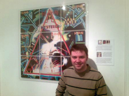
I had this idea, when I discovered that the record companies intended to release ‘at least four singles’ from the album, of dividing the album sleeve design into four sections to use on the covers of the four singles. Later I discovered there could be more singles and possibly different song releases in different countries. There was only one way to go – use NINE sections to create a huge 3-foot square version of the album sleeve.
‘HYSTERIA’ was the first time I had to create artwork for CD’s and I realised the new format could be the death-knell for vinyl. It was a defining moment for me. I hated the CD format, its size, its limited packaging possibilities and most of all I hated how it would destroy a medium I loved – vinyl. I knew for the singles I had to come up with something that had never been done before and would probably never be done again. The idea was a defiant celebration of 12” vinyl before its anticipated demise. It became a serious mission and I was determined to do whatever it took to get the idea off the ground. To design a ‘set’ of singles before the first one was released was a real challenge – especially not knowing how many there would be or what they would be – but I knew the idea was good. If there were problems we’d find a way to make it happen. I showed the band the idea and they loved it. We decided that the ‘missing’ sections not allocated to singles should become part of an Edition Box Set when thelast single was released. With massive support for the idea from Peter Mensch, he persuaded the record companies to go with the idea despite the huge cost of production. It is hard now, in our digital download age, where designs only stretch to pixel widths, to imagine a market where the importance of of vinyl allowed inspirational ideas to flourish and where the production of singles could be so extravagantly experimental.
I didn’t realise it at the time but I’d taken on a logistical nightmare. Not only were songs released in different territories in a different order and with different release dates – in different territories the single’s sleeve-art was not even the same size. (You would think, wouldn’t you, that 12” and 7” singles formats would be consistent? – but they weren’t.) There wasn’t a huge difference but enough to mean each division into nine sections had to be re-figured to suit each territory – to make sure they all fitted together perfectly. Earlier I told you how I had no idea where that ‘screaming head’ came from but, believe me, there were times I thought it was some kind of weird premonition of how I would actually feel (and look!) during the project. (see NB at end of blog to get to grips with the release complications)
I was involved in an exhibition early this year in London, celebrating the history of vinyl and, for the first time, I actually put all nine sleeves between two sheets of clear perspex and displayed the giant album as the centre-piece of the show. It looked fantastic …
Ok … it’s FanTime …
During the exhibition at the A&D Gallery a new benchmark was set to define ‘Serious Fan’ – Juan is loyalty and dedication personified. I met him at the gallery and he had a wonderful story to tell …
Juan lived in Madrid. He saw the exhibition advertised but there were only a few days left to get to England before the show closed on the Saturday. He was working so couldn’t leave until Saturday morning. He phoned his English friend who lived in London to ask if he could stay with him for the weekend, bought a plane ticket and flew to London.
So …. Juan arrived and said to his friend,
‘I have to go to this exhibition.’ …
‘Where is it?’ said the friend …
Juan checks on the website. ‘Chiltern Street, West One,’ he says …
‘No’ says his friend, ‘you’re confused Juan – Chiltern Street is where I live. That’s where
you are now. Where’s the gallery?’ …
Juan double-checks. ‘Chiltern Street. West One.’ he confirms.
Impossible to believe but the only friend Juan had in London lived ten doors away from the exhibition. It doesn’t get better than that does it? What are the chances of such a co-incidence? Nada. It’s people like Juan who are the key to maintaining what I believe my work is all about – being true to the loyal fans and inspirational enough to impress new ones. Here he is …
*Note: It did my head in just reading these stats (supplied by Mark from the DEF LEPPARD fan club – thanks Mark). It’s no wonder I had to ask Mark for the configurations – I just couldn’t remember. Now I know why!
THE NINE SECTIONS OF ‘3 X 3’
1 2 3
4 5 6
7 8 9
1 = no single available
2 = Hysteria
3 = Love Bites
4 = Armageddon It
5 = Animal. (First single release in UK)
6 = Women (US only. First single release.)
7 = no single available
8 = Pour Some Sugar On Me
9 = Rocket (Europe only, but UK had different, non-segment sleeve)
The special limited 12″ edition of “LOVE BITES”: the limited edition of that release had the 12″ sections of 1, 3 (Love Bites itself, obviously), 6 (since the UK did not have a release for “WOMEN”), 7, and 9 (some countries released this as “ROCKET”).
AndyLGR Says:
“Andie, these last blogs have given us an interesting insight into 2 of the most iconic album sleeves ever. Sleeves that are as recognisable as a part of the Lep’s career as their music.
Its great to see the rough sketches and to hear the stories behind the ideas as they unfolded.
Also that was a really good piece on Steve Clark. You spoke with respect and dignity for the great man, which unfortunately a lot of people don’t do enough of when they write or speak of him. Thanks.“
For complete versions of these extracts, comments and more CLICK the following LINKS:
14. DEF LEPPARD – Part One
15. DEF LEPPARD – Part Two
16. DEF LEPPARD – Part Three
17. DEF LEPPARD – Part Four
18. DEF LEPPARD – Part Five
20. DEF LEPPARD – Part Six


